

-Molarity-
Born with a focus on streamlining the process of managing one’s dental care
Project Type
Mobile First Website
Scope of Work
UX Research, Branding, UX/UI Design
Tools
Figma, Canva, Adobe Illustrator
Domain
Healthcare, Dental, Booking Management
Client
Personal Project
Date
July 2024
Project Overview
Background
Having been working at dental offices for quite some time, I noticed the lack of a platform where patients can conveniently log-into, book an appointment, access their personal health and dental care information/records, and communicate effectively with their office.
Problem
A lot of dental offices still heavily rely on phone calls and in-person communication to schedule and manage patient appointments.
Patients with busy schedules reported a need and desire for a one-stop online platform where they can accessibly manage their dental care from the comfort of their home.
Goals
Having a dental online platform where patients can login and get the Personal health information (PHI) they need, store their records/files, message dental office associates, and get reminders of their upcoming appointments.
“How Might We Be Able To Make Patients Feel At Ease With Their Dental Care Management Process?”
Key Features
Key Features
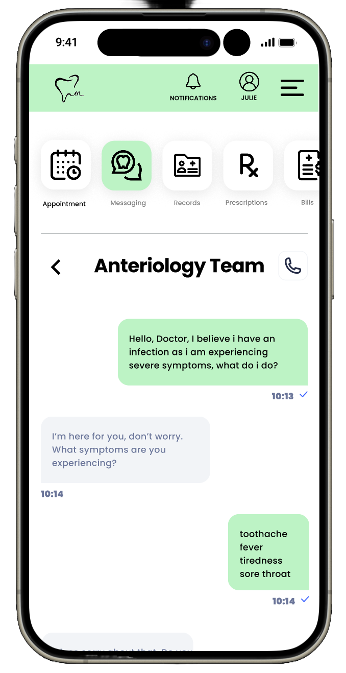
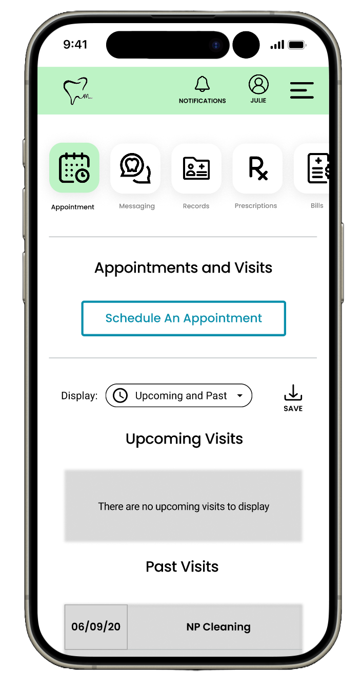

Molarity boasts the critical features such as Messaging System with your dental provider, Appointment System to conveniently manage your bookings at the comfort of your home, and Records System to view/transfer your PHI at the tip of your finger to stay updated, and MANY MORE to come
-

Research
User Interviews
User Surveys
Competitive Research
Affinity Mapping
-

Define
POV & HMW Statements
User Personas
Feature List
-

Ideate
User & Task Flows
Site Map
Initial Sketches
Low-Fidelity Wireframes
-

Design
Branding & Logo Design
High-Fidelity Wireframes
Prototyping
-

Testing
User Usability Testing
High Priority Revisions
Research
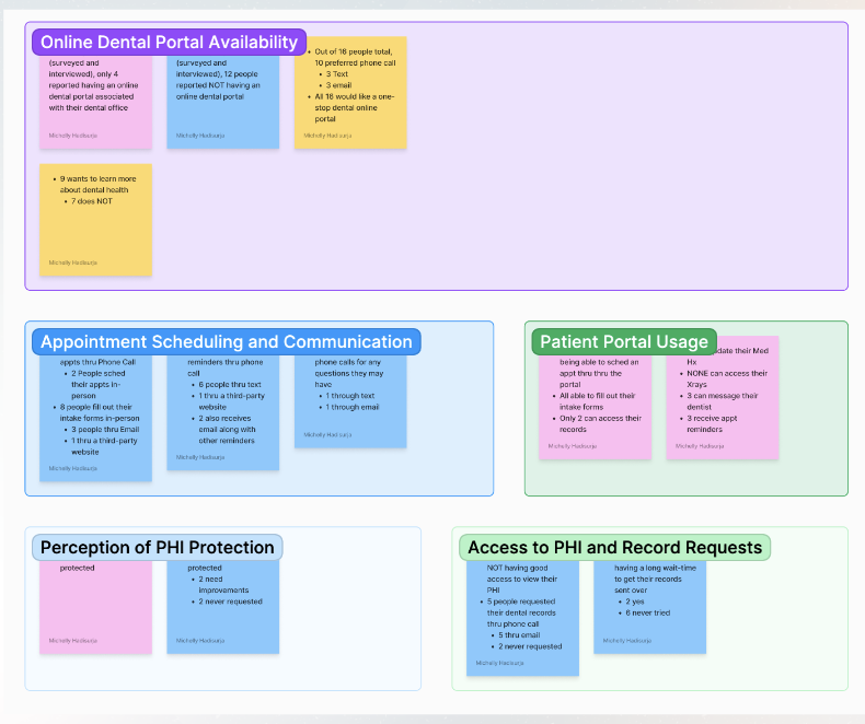
Spending a lot of my early young adult years working in dental field, I became curious about the pain points patients have in managing their dental care. I noticed that unlike most medical practices where there is a more uniformed presence of an online platform, most dental offices still heavily rely on calling/in-person interactions to manage patients bookings. Through this research experience, I sought to connect with other dental professionals and patients to learn more in-depth about their experiences. This enabled me to:
Establish Empathy with Users
Build an Understanding of Their Pain Points
Learning About the Features They Want to See in the Platform
Get an Overall Sense of The Emerging Patterns Shared by Users
“I wish I have a dental platform where I can connect with my dental provider and manage my bookings and records and billings all in one spot..”
-a current patient
The interviews and surveys I conducted helped me discover and learn more about the patterns users share in their pain points in managing their dental care. Through the feedback that I gathered, this project is then centered on improving patient experience with managing their dental care at the tip of their fingers.
The competitive research allows me to further unearth the need for a uniform platform where users can easily have access to all the features they want to see.
As I synthesized the affinity map with the foundational research that I’ve gathered, I paid particular attention to the challenges patients face with their current dental management system.


Define
After collecting data and insights from my interviews and surveys, I decided to dive a bit deeper to compile a couple of ‘Point of View’ (POV) and ‘How Might We’ (HMW) statements to understand and highlight the pain points that users see in order to create better user personas. The statements that I crafted from my research are as follows:


After I have clearly defined and articulated my users’ needs and challenges through the personas, the next step of my design process was to compile a list of features that would address those needs.

These statements help me to develop two user personas that will be the center of my design. The two personas consist of a dental professional and a busy patient that have distinct challenges and goals. Their challenges and needs that I have uncovered from my research would be the foundational centerpiece of my design as I move forward in my design process.


Ideate
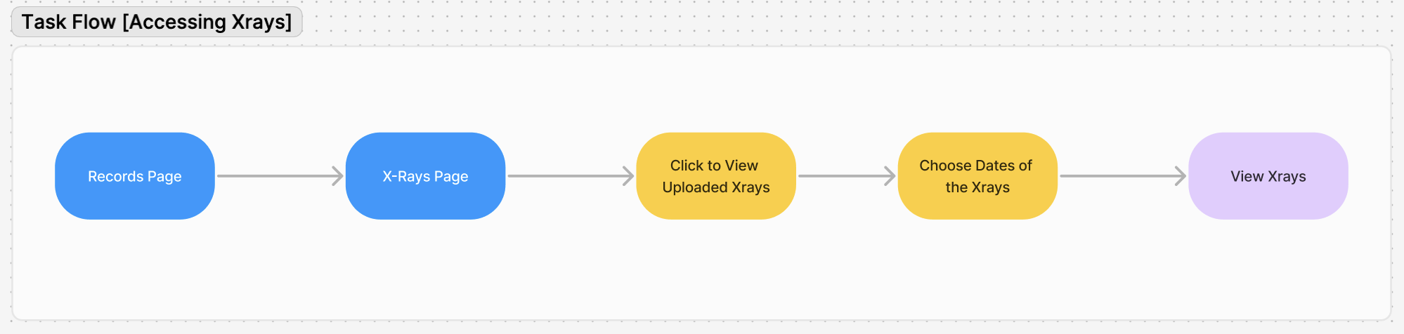
Before starting on the site structure, the next step was to map out the paths a user might take to complete a task within the website and to define and flow out what those tasks may look like. For these user and task flows, I stayed focused on three distinct tasks such as:
Account Creation
Booking an Appointment
Accessing X-Rays


With these diagrams in hand, I proceeded with the next step of designing the layout of the screens with initial sketches. I took inspirations from well-known medical websites such as Kaiser Permanente, Sutter Health, and Stanford Health to design a clean and professional website that can serves and addresses the needs of the users.


In order to confirm the viability and accessibility of my sketches, I moved forward with the design process and started to bring these sketches into a higher-fidelity wireframing. I then seek feedback from some of the users that I have interviewed to ensure that my design makes sense and able to provide the necessary information and actions for users to perform and complete the task.
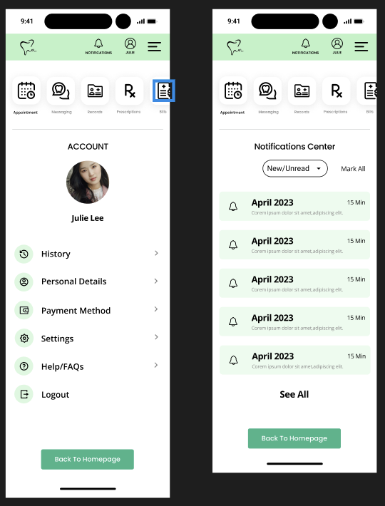
From the feedback I received, I also decided to design another feature to the platform such as the messaging center. I also added how a profile and notification pages would look like.


Design
With mid-fidelity design in place, it was time to come up with the unique branding and UI Kit that would appeal and be accessible to all patients.
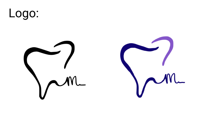
For the branding, I went from Dental&Me to ToothFairy to Molarity. I decided to settle with Molarity because I thought it sounded much more professional, unique and in tune with dental terminology, which was in tune with the intended usage of the website.
I chose ‘Mint Green’ as the primary color bc it promotes feelings of renewal, tranquility, growth, and inspiration.
As soon as I was settled with the brand ‘Molarity’, I went right into sketching a few potential logos and after a couple of sketches, I decided upon the 3-D like picture of a tooth with the letter ‘m’ attached to its tail to encourage the memorability of the brand. The tail also represents a string of floss as to further visualize the dental nature of the brand.

With the components and the key features all figured out, I moved forward with the creation of high-fidelity model of the website.


With these high-fidelity wireframes structured, I developed a prototype in Figma in order to test out the main user flows:
Account creation
Booking a new patient appointment
Viewing an existing X-Ray
Messaging a dental provider
-Comforting-Convenient-Loyal-Personalized-Innovative-


Testing
After the completion of my prototype, I conducted a usability testing with the help of 5 participants. All participants are current patients that regularly receive dental care from their respective dental providers. All users were able to complete each task with a 100% success rate.
Creating an account
Booking a new patient appointment for a specific date.
Viewing an existing X-Ray
Calling a dental office provider
Testing Insights:
All users were able to successfully complete each task without encountering an error
All users mentioned how friendly the website feels and how they were able to navigate through each page without needing much guidance
Users really like the aesthetic of the website and mentioned how professional it looks
Success Metrics:
Achievement Rate. 100%
Errors Encounters. 0%
Average time on task 1. 45s
Average time on task 2. 80s
Average time on task 3. 50s
Average time on task 4. 45s
Areas for improvement:
One user feels like the homepage needed some smoothing in terms of the wordings. I had a lot of the words ‘manage’ in each of the button on the homepage and a suggestion was made to reduce the wording on each button
The consistency of the color
The removal of the line on the bottom of the navigation bar to eliminate the old-fashioned feels
Conclusion
My passion in healthcare and my background in the dental community inspired me to work on this project. I noticed a lack of available and user-friendly website for dental patients in order for them to properly manage their dental care, especially during the busy times.
The design process throughout this journey motivated me to create a product that could satisfy my intended users. Through the testing process, I was able to receive overwhelming positive results from the users, This made me feel that I’ve met my goals and I felt tremendous satisfaction from it.
Should there be a chance to bring this prototype to life, I would like to incorporate the billing and prescriptions features so as to further eliminate the need for users to spend time calling their dental office or visiting them in-person, and ensuring the convenience of managing their dental care at the tips of their fingers.