

Flaming Attic
Jewelry Website based in Jakarta
Project Type
Responsive Web Design
Scope of Work
UX Research, UX/UI Design
Tools
Figma, Canva, Adobe Illustrator
Domain
E-commerce
Client
Personal Project
Date
Dec 2024
Project Overview
Background
Flaming Attic is an Indonesian based jewelry brand that was established in 2019. It is still a pretty small brand that primarily uses Instagram for promotions and endorsements. When speaking with the brand owner (stakeholder), she desires the site to be user-friendly, intuitive and also having an edgy, modern-minimalistic look to allow further updates in the future.
Problem
Flaming Attic lacks a dedicated website, making it difficult for customers to fully explore its meaningful jewelry collections, build trust, and complete purchases easily—limiting growth beyond Instagram.
Goals
Create an engaging, emotionally resonant website that drives conversions
Ensure fast, accessible, and trustworthy online shopping
Support brand storytelling while keeping navigation simple and clear
“How might we create a seamless and emotionally engaging online shopping experience that helps customers discover meaningful jewelry, understand its symbolism, and feel confident in their purchase beyond Instagram?”
Key Features
Key Features


Flaming Attic’s website will offer an emotionally engaging shopping experience by allowing users to browse jewelry by symbolism and mood. Detailed storytelling and product descriptions build trust and deepen connection, while a mobile-optimized design ensures smooth navigation and checkout. Features like wishlist functionality, transparency about sustainable craftsmanship, and customer reviews provide social proof and enhance confidence. A simple, secure checkout rounds out a seamless and meaningful user journey.
-

Research
User Interviews
User Surveys
Competitive Research
Affinity Mapping
-

Define
POV & HMW Statements
User Personas
Feature List
-

Ideate
User & Task Flows
Initial Sketches
Low-Fidelity Wireframes
-

Design
Branding & Logo Design
High-Fidelity Wireframes
Prototyping
-

Testing
User Usability Testing
High Priority Revisions
Research
User Interviews
The primary goal of the user interviews is to uncover customer needs, preferences, and pain points related to shopping for meaningful jewelry online in order to create a user-centered website design.
Specifically, the objectives were to:
Understand how potential customers currently discover and shop for meaningful jewelry.
Identify the emotions, values, and symbolism users seek when choosing jewelry.
Explore pain points and frustrations with existing online jewelry shopping experiences.
Gauge user trust factors and what builds confidence in purchasing from new brands.
Learn preferences around website features, navigation, and mobile usability.
Discover expectations for storytelling and brand connection in the shopping journey.
Assess interest in wishlist functionality and product transparency (e.g., sustainability).
Participants:
Total: 5 users
Age Range: 22-45
Demographics:
Mix of online jewelry shoppers (first-timers and frequent buyers)
Some who have discovered jewelry through Instagram or Etsy
"I want jewelry that feels personal and meaningful, but it’s hard to find pieces online that really explain the story behind them. I need to understand what I’m wearing and why it matters to me."
Key Insights
Meaning Drives Purchase
Many users emphasized that jewelry must carry personal or symbolic meaning to feel worth buying. Aesthetics alone aren’t enough—customers are drawn to emotional connections.
Transparency Builds Trust
Trust was a recurring concern. Users want to know who is behind the brand, where materials come from, and how the jewelry is made. Small or lesser-known brands especially need to build credibility through clear, honest storytelling.
Mobile-Friendly Shopping is Essential
“Users frequently browse and even purchase on their phones. They expect a seamless, intuitive mobile experience that mirrors or exceeds desktop usability.
Visual Quality and Styling Matter
High-quality photography and styled imagery are critical for conveying emotion and helping users visualize the piece on themselves.
Wishlist Feature is Highly Valued
Users often window shop and return later. A non-obtrusive wishlist feature—especially one that doesn’t require login—was repeatedly mentioned as helpful.
User Surveys
Emotional Connection to Jewelry
Create meaning-based navigation filters (e.g., "Strength," "Rebirth," "Letting Go") and pair each piece with symbolic storytelling that evokes emotional resonance.
Trust in the Brand & Product
Build trust through transparency — show behind-the-scenes craftsmanship, ethical sourcing, artisan bios, and material origins on product pages and the About section.
Seamless Mobile Experience
Design with mobile-first UX in mind—use sticky CTAs, fast-loading images, swipeable galleries, and tap-friendly navigation to support mobile behavior.
Strong Visual Storytelling
Use high-quality editorial imagery, videos, and styled lookbooks that reflect the symbolic mood of each piece and collection.
The objective of the user survey is to gather quantitative insights on customer preferences, shopping behaviors, and attitudes toward meaningful jewelry to guide website design decisions.
Total Respondents: 12
Age Range: 21-45
Gender: 72% female, 18% male, 10% non-binary/other
Shopping Frequency:
Once every few months: 44%
Seasonally (holidays/events): 38%
Monthly or more: 18%
Key Insights
Emotional storytelling + aesthetic design are key differentiators
Transparency (about materials, pricing, and policies) builds purchase confidence
Users want features that feel curated, personal, and mobile-friendly
The brand name “Flaming Attic” resonates strongly with the target audience
Users expect zoomable, high-quality images and 360° views
Desire for fast, secure checkout, ideally under 3 steps
Competitive Analysis + Affinity Map
As I synthesized the affinity map with the foundational findings that I’ve gathered and similar online jewelries websites, I paid particular attention to the challenges people face with purchasing jewelries online.
Competitive Analysis Highlights:
Lola Ocenia vs. TenderBeing vs. Ravipa
Similarities:
Sustainability practices
Emphasis on meaningful design
Utilization of social media for engagement
Differences:
Lola:
Vintage aesthetics and sustainability
Premium brand
TenderBeing:
Artistic and bespoke
Premium brand
Ravipa:
Younger, trend-focused demographic
More affordable

Design Opportunities

Affinity Map Highlights:
Emotional Connection
Users want jewelry that tells a story or holds symbolic meaning.
Trust & Transparency
Users hesitate to buy from small or new brands without clear info on materials, ethics, or origins.
Ease of Use
Shoppers want a clean, intuitive, mobile-first website experience.
Visual Experience
Strong visual presentation is key: close-ups, styling photos, and mood-driven imagery help users imagine wearing the jewelry.
Wishlist & Saving Features
Users often browse before they’re ready to buy and want to save favorites without making an account.

Define
After collecting data and insights from my interviews and surveys, I decided to dive a bit deeper to compile a couple of ‘Point of View’ (POV) and ‘How Might We’ (HMW) statements to understand and highlight the pain points that users see in order to create better user personas. The statements that I crafted from my research are as follows:
POVs
A spiritually inclined, style-conscious shopper needs a way to find jewelry that resonates with their personal emotions and journey, because existing online platforms often lack storytelling and symbolic context that make pieces feel truly meaningful.
A cautious first-time buyer needs reassurance and transparency from a small brand because they fear being misled by vague product descriptions and lack of brand credibility.
A mobile-first shopper wants a simple and emotionally engaging browsing experience because they often browse on the go and feel overwhelmed by cluttered or generic e-commerce sites.
A thoughtful gift-giver wants to find the “right” piece quickly and confidently without knowing exactly what they’re looking for because they want the gift to be personal and meaningful.

HMWs
How might we help users discover and connect with jewelry that reflects their emotions, intentions, or life moments?
How might we build trust with new customers through storytelling, transparency, and clear communication?
How might we design a smooth, mobile-optimized experience that still captures the poetic and symbolic nature of the brand?
How might we help users easily find meaningful jewelry even if they don’t have a specific item in mind?
After I have clearly defined and articulated my users’ needs and challenges through the personas, the next step of my design process was to compile a list of features that would address those needs.
Key Features:
Symbolic Product Filters
Shop by emotion, meaning, or intention (e.g., love, rebirth, protection) instead of only by category.
Story-Rich Product Pages
Each piece includes a story or symbolism section, with background on its inspiration, materials, and emotional resonance.
Mobile-Optimized UX
Clean, intuitive interface designed for on-the-go browsing and easy checkout, with responsive design across devices.
Transparent Sustainability Info
Highlight ethical sourcing, upcycling practices, and handcrafted methods to build trust with value-conscious shoppers.
Wishlist / Save for Later
Visitors can save favorites without requiring account sign-up—ideal for window shoppers and gift planners.
Customer Reviews & Testimonials
Real experiences and sentiment help reinforce authenticity, build credibility, and support decision-making.
High-Quality Visuals & Styling
Zoomable close-ups, model styling shots, and mood-driven imagery that reflect the brand’s poetic and symbolic vibe.
Fast & Secure Checkout
Streamlined, trustworthy checkout experience with multiple payment options (credit, PayPal, ShopPay, etc.).
These statements help me to develop 2 user personas that will be the center of my design. The two personas have their own distinct challenges and goals in building new connections. Their pain points that I have uncovered from my research would be the foundational centerpiece of my design as I move forward in my design process.

Ideate
The next step was to create a map out the paths a user might take to complete a task within the website. For this user flow, I stayed focused on three distinct tasks such as:
Account Creation and Loyalty Program FLow
Product Discovery Flow
Purchase Flow

With these diagrams in hand, I proceeded with the next step of designing the layout of the screens. I took inspirations from well-known jewelry sites such as Tiffany&Co. and Ana Luisa to design a clean and enticing website that can serves and addresses the needs of the users and at the same time encouraging them to learn more about Flaming Attic as a brand.
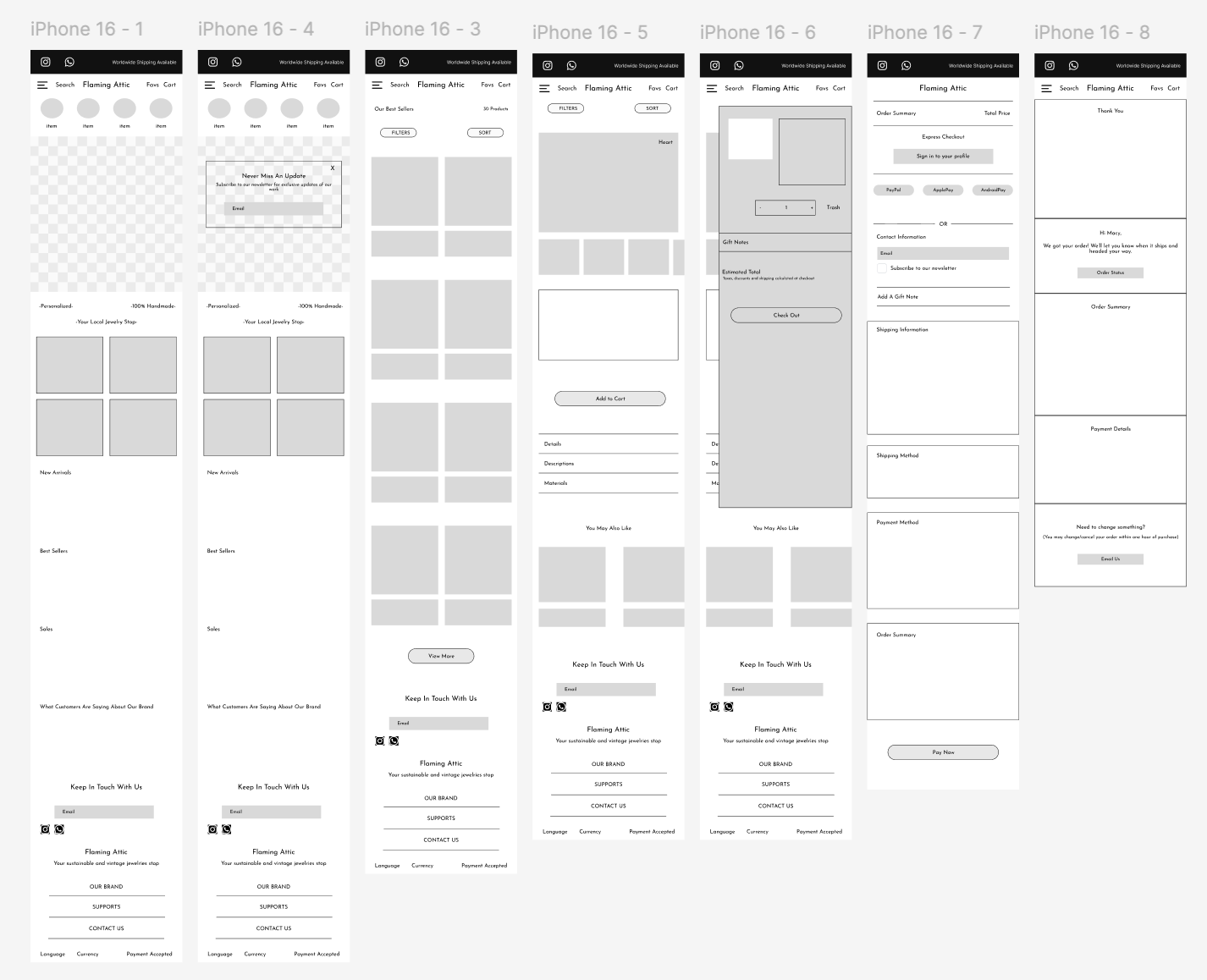

In order to confirm the viability and accessibility of my lower-fidelity wireframes, I moved forward with the design process and started to bring these designs into a higher-fidelity wireframing. I then seek feedback from some of the users that I have interviewed to ensure that my design makes sense and able to provide the necessary information and actions for users to perform and complete the task.


Design
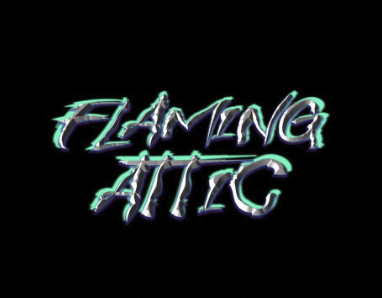
With mid-fidelity design in place, it was time to come up with the color palette of the brand’s site.
To stay consistent with the brand nature, I followed the color palette of its logo.
Brand Logo
With the components and the key features all figured out, I moved forward with the creation of high-fidelity model of the website. Using the feedback I’ve received from the user testings, I added a couple more frames to provide instructions of the feature for better accessibility and functionality of the feature.


With these high-fidelity wireframes structured, I developed a prototype in Figma in order to test out the main user flows:
Browse & Discover Flow (New User)
Product Detail to Purchase Flow
Mobile-Optimized Flow

-Personalized-Unisex-100%Handmade-

Testing
After the completion of my prototype, I conducted a usability testing with the help of 5 participants. The participants were a mixture of active online jewelry buyers and individuals that were inexperienced with online purchasing experience. The test goals were:
Evaluate how easily users can browse, understand, and purchase jewelry.
Assess clarity and effectiveness of the filtering system.
Identify friction points in navigation, checkout, and wishlist features
Testing Insights:
Emotional storytelling and visual-first navigation strongly resonated with users.
Trust-building content (e.g., values, real stories, reviews) was a critical factor for confidence.
Users want clarity on secondary flows like wishlist and tracking.
Even mid-fi testing showed that aesthetic-driven UX outperforms technical sorting for emotional products like jewelry.
Participants
5 users, ages 22–35
Mix of mobile and desktop users
Mix of prior experience shopping online for jewelry or meaningful gifts
Success Metrics
Achievement Rate: 95%
Avg. Time on Task: 2 min 30 sec
SUS Score: 82.5
Brand Engagement: 4.75/5
User Confidence: 4.50/5
Likelihood to Use: 4.75/5
Areas for improvement:
Improve wishlist visibility with a dedicated icon in nav and “Saved Items” label.
Prioritize product info hierarchy (size, care, material) higher on PDPs.
Refine mobile menu hit areas for accessibility.
Conclusion
Designing Flaming Attic’s first jewelry website was an enriching journey that highlighted the importance of aligning emotional storytelling with clear, intuitive digital experiences. Through user interviews and usability testing, we learned that shoppers of symbolic jewelry value more than aesthetic—they seek meaning, emotional resonance, and a sense of trust in the brand. Crafting a product discovery flow around symbolism rather than traditional categories proved to be both a differentiator and a driver of engagement. We also saw how thoughtful UI elements like save-for-later features and emotionally guided filters improved decision-making for hesitant users. Lastly, this project reinforced the value of mobile-first design, transparency in branding, and iterative testing to validate design assumptions. Moving forward, these learnings will inform how I design for niche, story-driven e-commerce experiences that bridge emotion with usability.